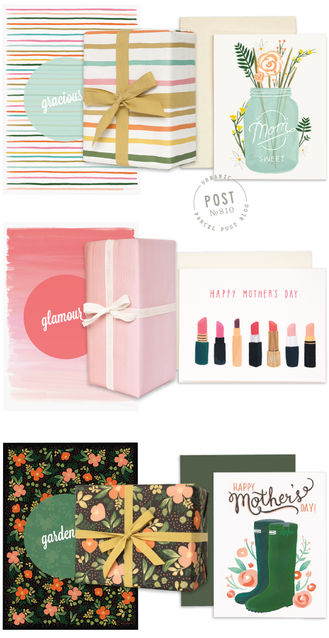
Hi everyone! It has been a project in the making and we’re beyond excited to announce… that we’ve revamped Parcel Post! We’ve got a fresh new look and a new URL — urbanicpaper.com/blog. If you are subscribed to Parcel Post via RSS or have us in your feeds, please re-bookmark us. (Our wordpress.com site will no longer be active.) As a thank-you, we’ll be sending all of you a fun little surprise in the mail when you move over with us. See details on the new blog.
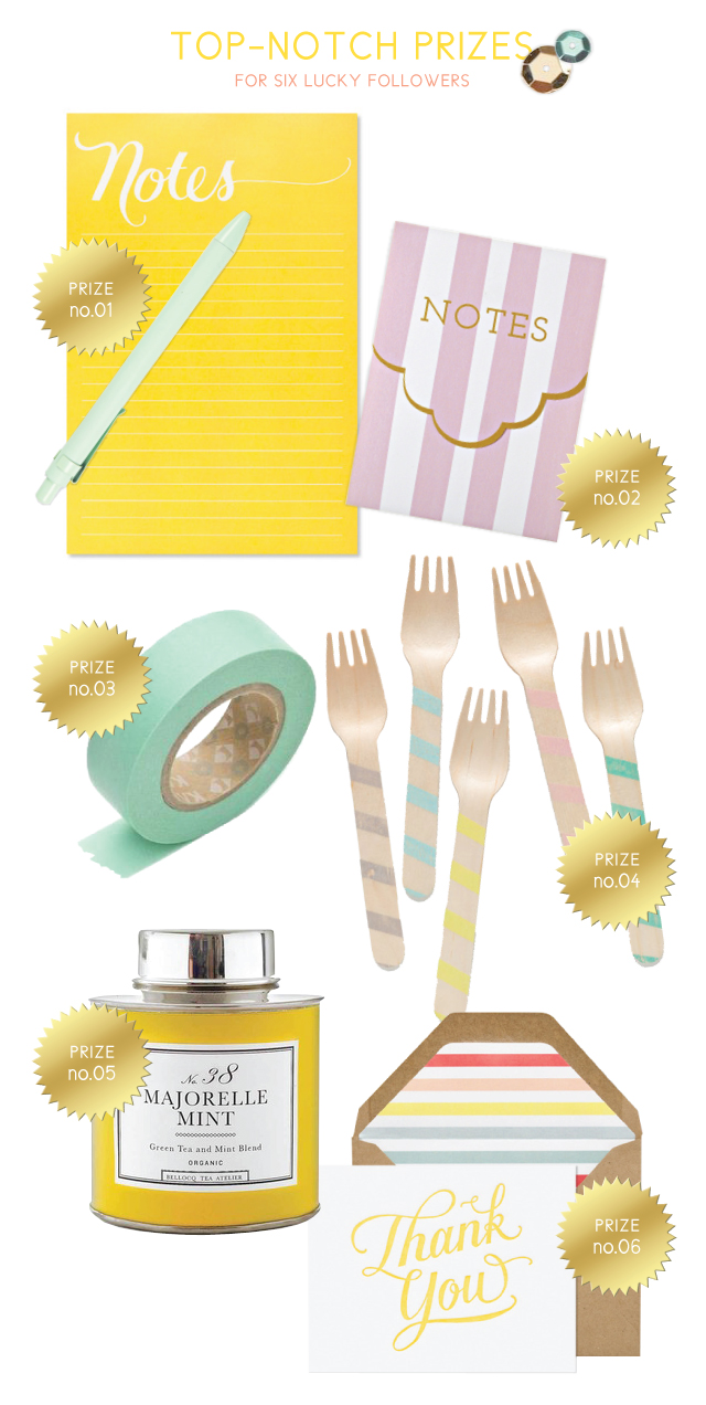
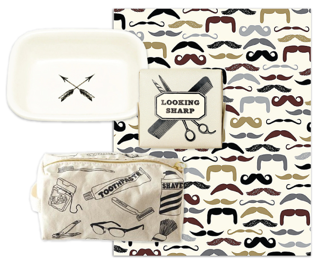
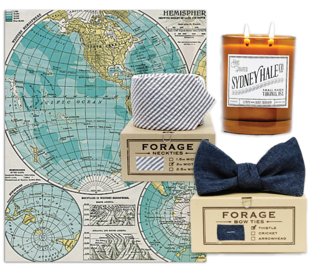
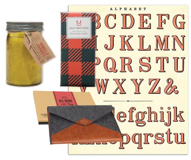
And in celebration, we’re having a SUMMER GIVEAWAY. To win, all you need to do is leave a comment to this post on the NEW URL stating something in your life you’d like to re-invent. It felt so good to freshen up the blog and I’d love to hear about something in your life that you’d love to change as well. There will be six winners randomly selected and announced on 6/26. So check back to see if you’ve won! Each winner will receive one of the prizes below:
Now, come see our new digs!
xo *A
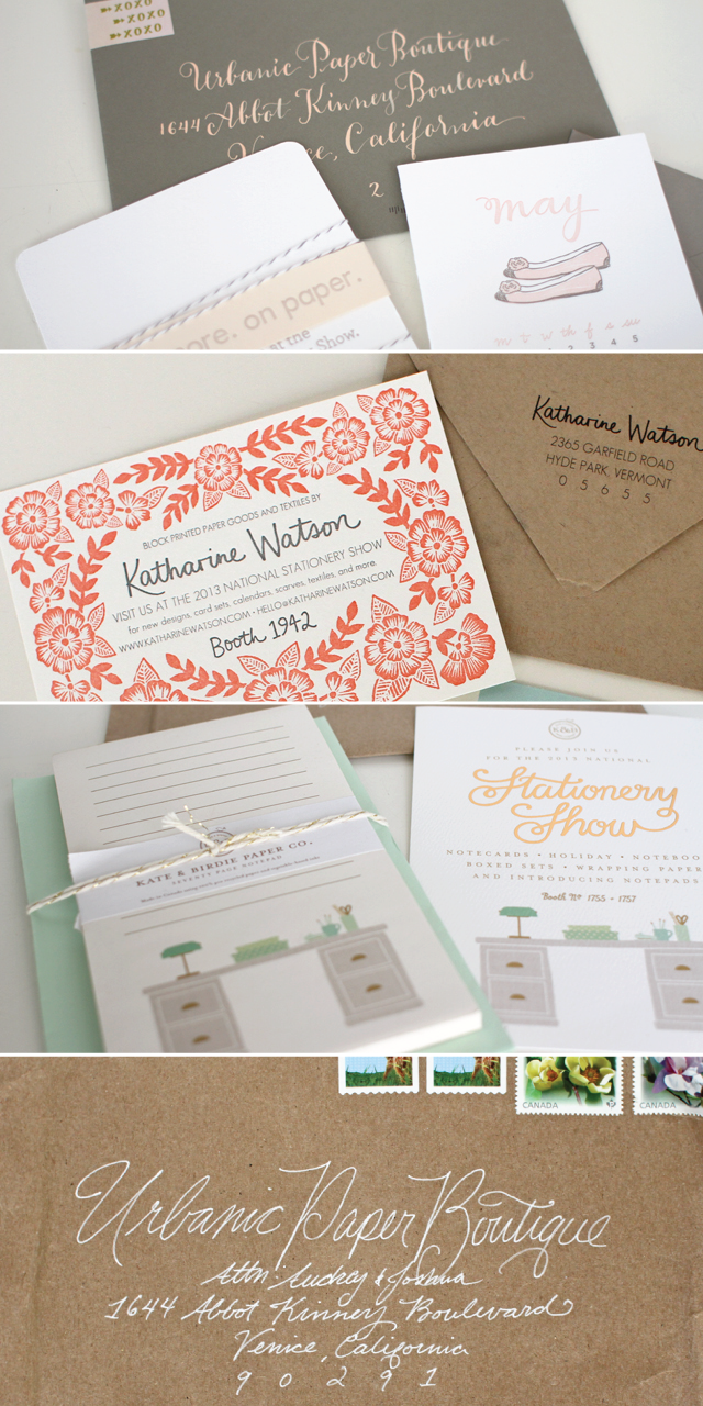
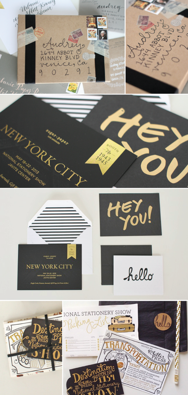


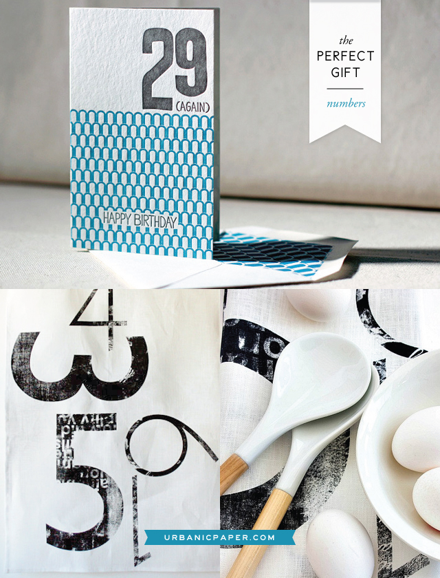
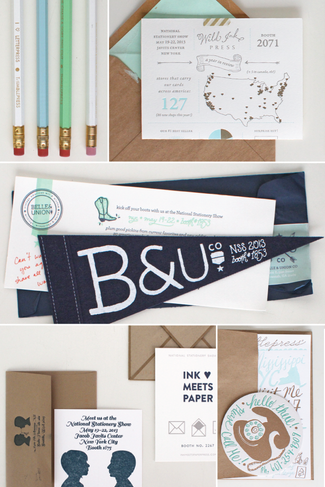 invitations above by : thimble letterpress, wild ink press, belle & union, tutta lou / orange twist, and ink meets paper
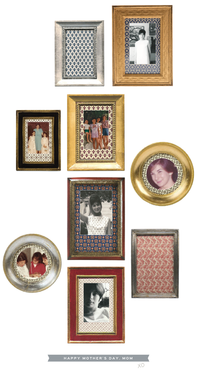


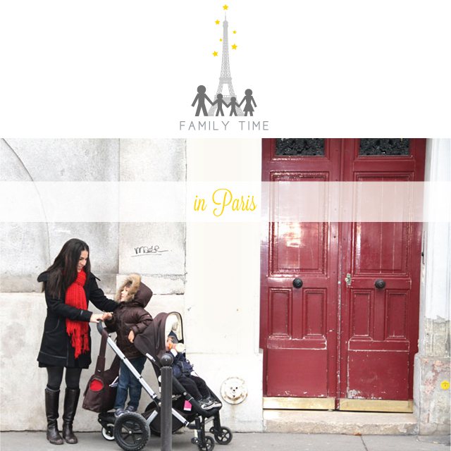
 I’m so happy to be finally blogging about it (and re-living it). We stayed in a
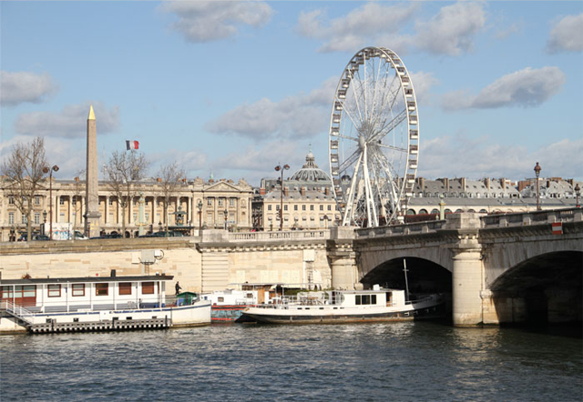
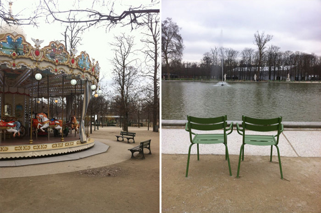 We stayed for 2 weeks and spent most of our days adventuring around town – seeing sites, hopping on carousels and digesting the beauty and rich culture of the city.
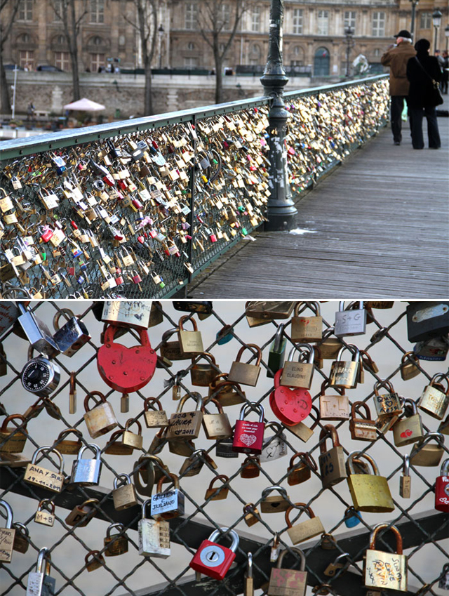 Love locks on the Pont des Arts
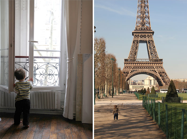
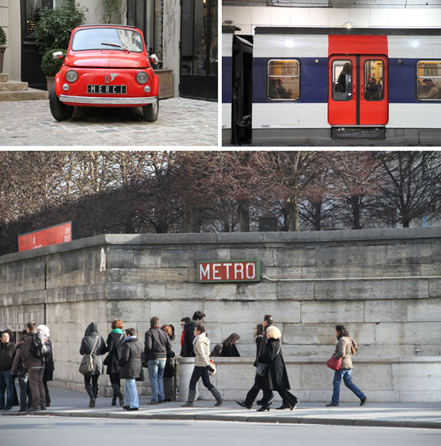 The metro got us everywhere. Definitely not easy with the two boys, but the kid-stand on our stroller was a lifesaver, enabling us to get down all of the narrow streets without taking up too much room.
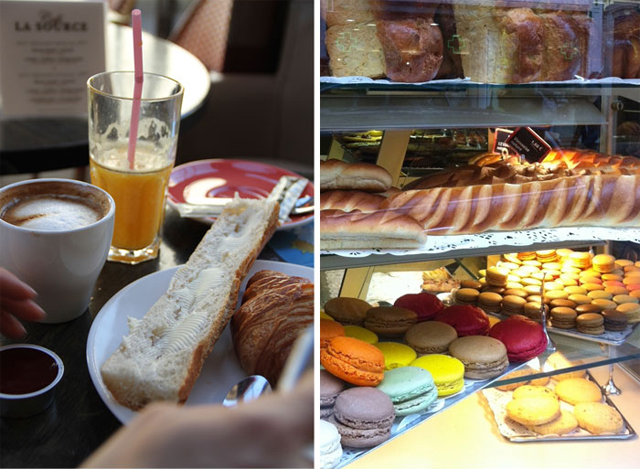 We ate as many baguettes, croissants and baked treats as humanly possible.
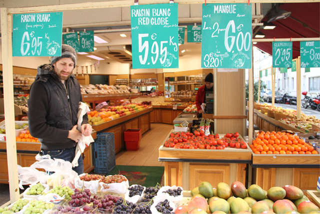
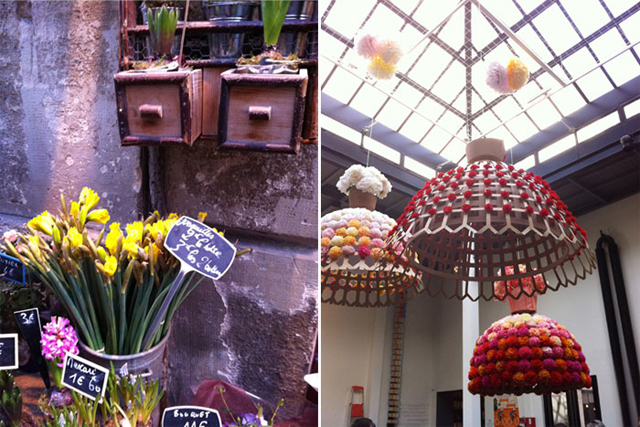 Flower stand in
 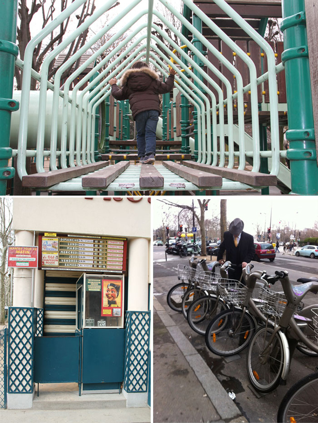 We discovered marionette theaters, lovely parks, book shops, patisseries and boutiques – lots of boutiques! Being that we are shop owners, this was beyond inspiring.
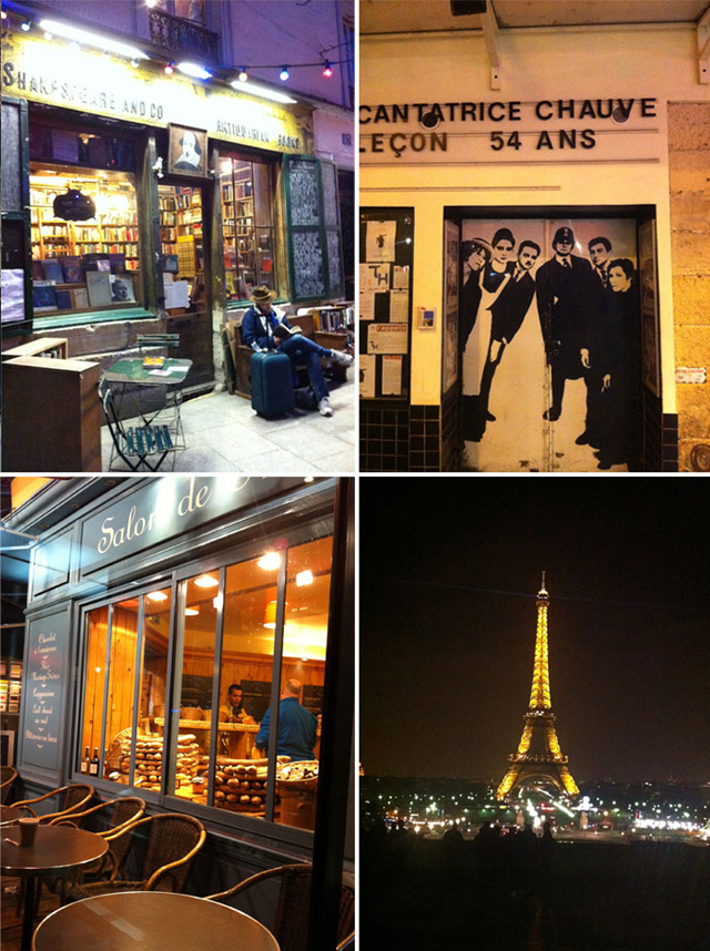 Night in the City of Light